
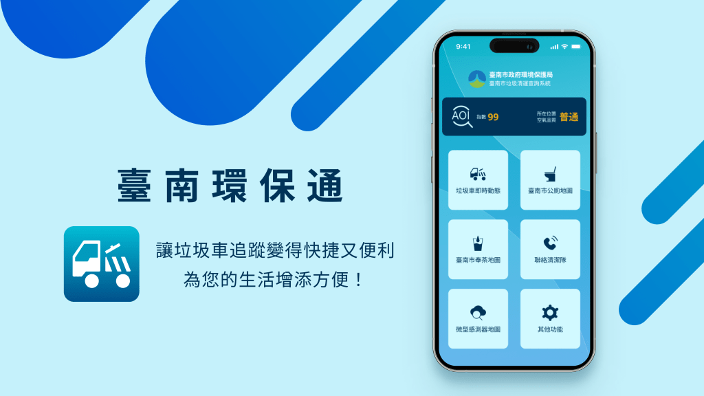
I independently redesigned the App, a service platform developed by the Tainan Environmental Protection Bureau. One of the main and most popular features is the ‘Real-Time Garbage Truck Tracker.’ My task was to improve the process of locating garbage trucks and enhance the user interface.

「Garbage trucks often run during work or class hours, so I have to rely on this app to catch them, but I often can’t use it smoothly.」
User’s Actual Feedback
Overview
Background
Applications developed by government or public institutions aim to serve the public for free, with a focus on social and environmental well-being. This requires greater emphasis on the “user experience" to meet public needs. The App initially provided garbage truck information and later added more environmental functions, becoming a comprehensive environmental protection application. Therefore, the focus of this redesign is on improving the “Real-Time Garbage Truck Tracker" feature, starting with user feedback to enhance service quality and convenience in daily life.
Problem
- The product’s information hierarchy is unclear.
- The display of garbage truck locations and schedules is overly complex, with too many icons making it difficult to read.
- The product lacks a unified design style.
- Notifications for garbage truck arrivals and departures are not intuitive or easy to understand.
Goals
- Reorganize the interface’s information hierarchy.
- Establish a unified visual style for the product.
- Simplify the display of garbage trucks and their locations.
- Integrate the schedule with notifications for garbage truck arrivals and departures.
| Timeline | Team | Responsibilities |
|---|---|---|
| 1 Week | Independent Production | UX/UI, UX Researcher |
Research
Research
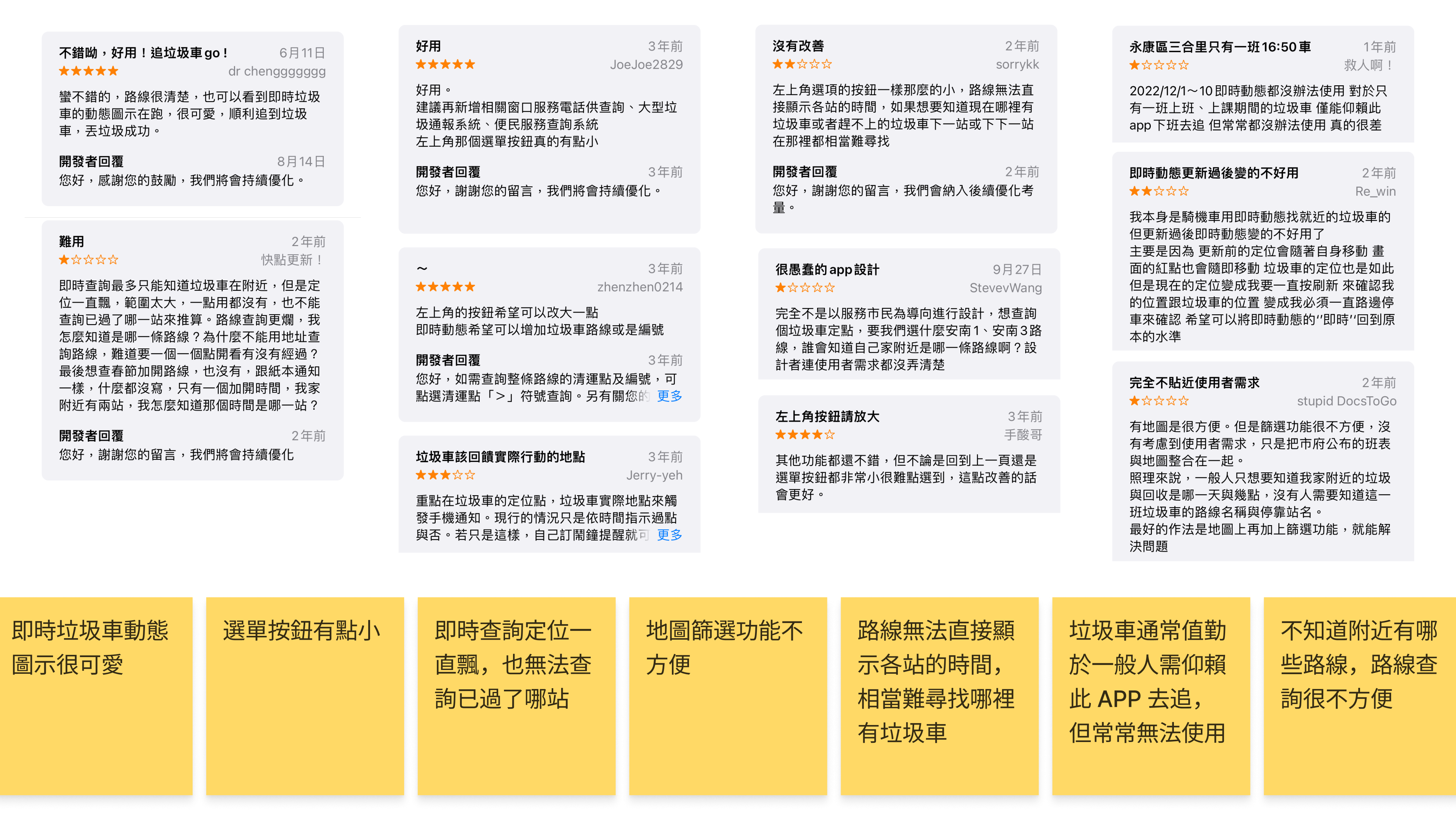
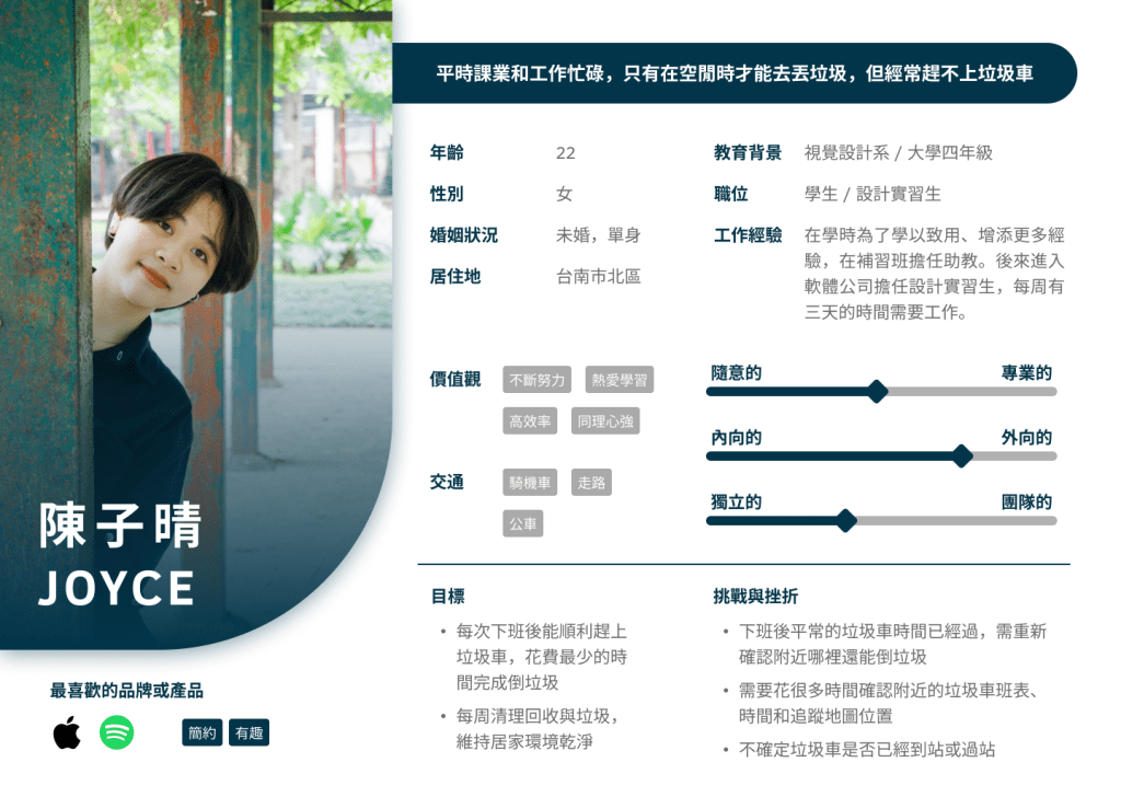
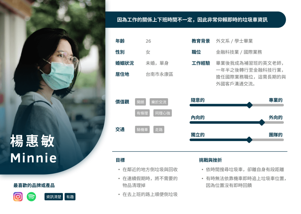
Based on reviews from the Google Play Store and interviews with three users, I identified the product’s issues and created two personas based on this information.
Using the information from the personas, I developed an Empathy Map to gain a deeper understanding of the users’ emotional experiences.
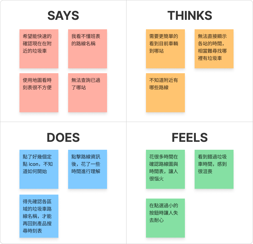
We found that users spend a significant amount of time trying to understand the content, often clicking various buttons without clearly understanding their functions, which leads to confusion during the operation process.
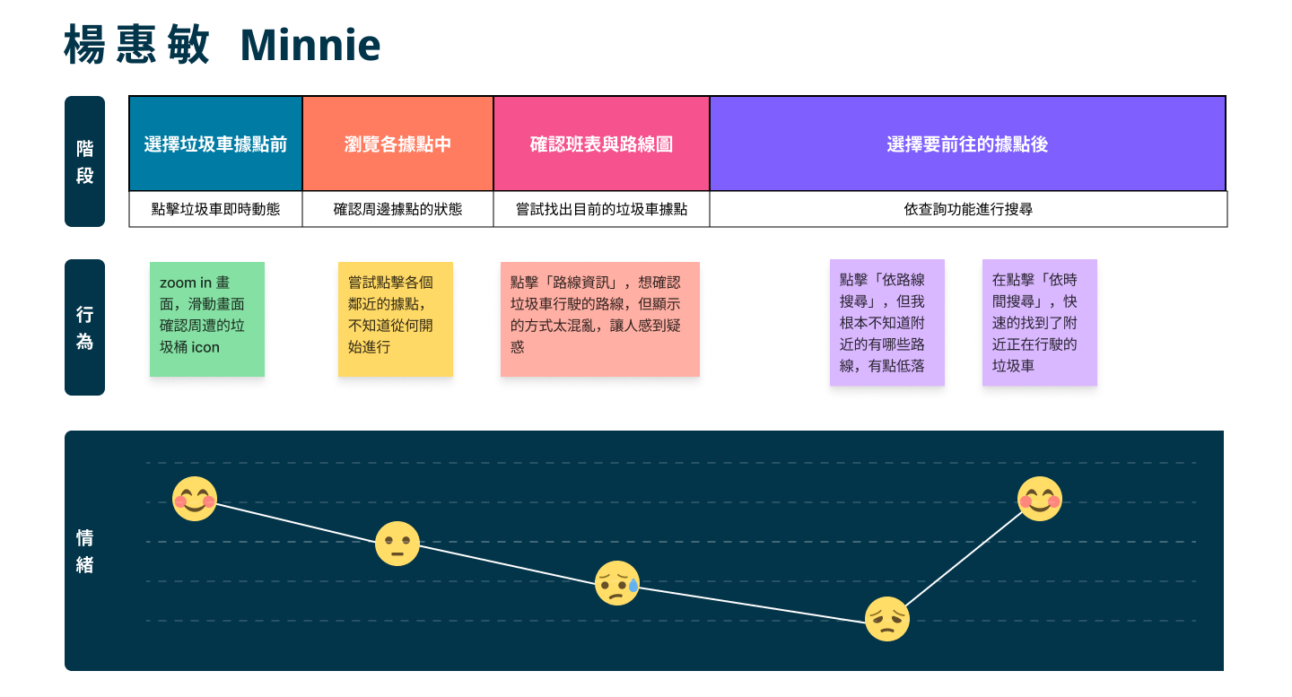
Next, by utilizing a User Journey Map, we will clearly outline the various stages of the user’s experience while interacting with this service, allowing us to gain deeper insights into their experiences and needs.

定義
We defined…
〝We defined that an organized young professional woman needs an app that can track garbage trucks in real-time, allowing her to efficiently manage waste disposal while commuting by scooter to and from work. Maintaining a clean living environment is crucial to her daily life and mental well-being.〞
— POV(Point Of View)
How Might We…
● How can we design a simple and real-time solution that allows users to track garbage truck movements?
● How can we help users better understand map information and make it more convenient to operate?
● How can we enhance the design consistency of the product to improve the user experience?
— HMW(How Might We)
As a result…
As an organized young professional woman, I hope to use an app that provides real-time and clear information on garbage truck movements, allowing me to efficiently manage my trash while riding my scooter to and from work, in order to keep my home clean.
— User story
Let’s make some hypotheses!
We believe that by providing a well-structured and easy-to-read garbage truck tracker, we can help users complete their waste disposal in the shortest time possible, thereby maintaining a clean home environment.
Let’s formulate a hypothesis!
If the app can provide a well-structured and user-friendly interface for tracking garbage trucks, users will be able to complete the task of disposing of their garbage in a shorter time, thereby more effectively maintaining a clean home environment.
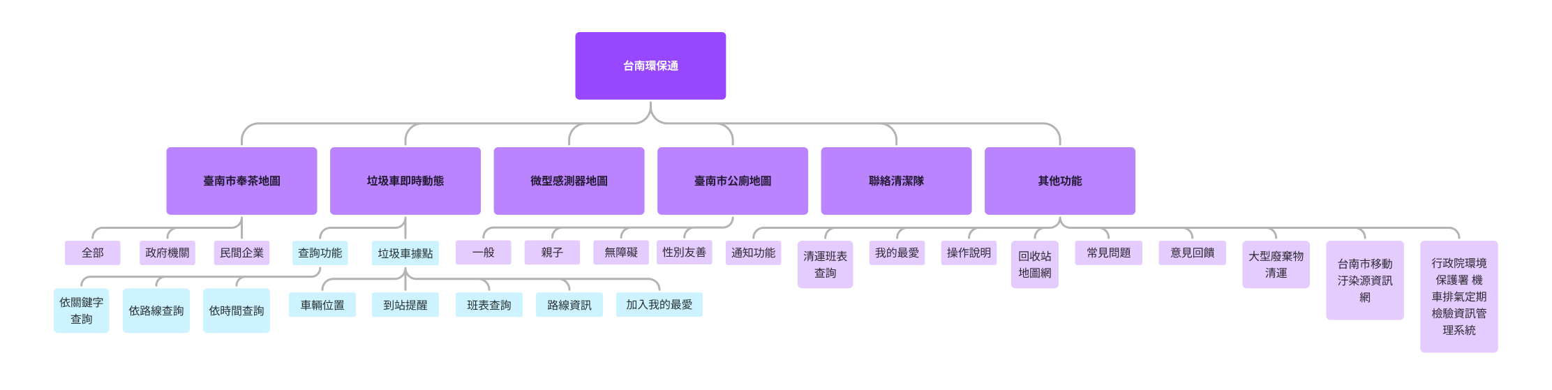
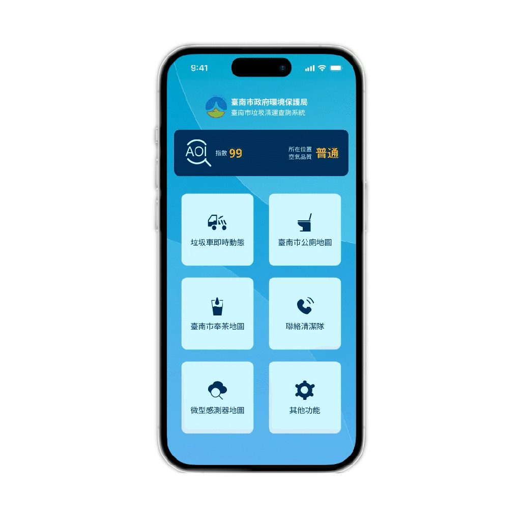
Functional Map
Utilize this method to gain a clearer understanding of the product’s functional architecture and identify improvements. This time, adjustments will be made specifically to the garbage truck tracking feature.
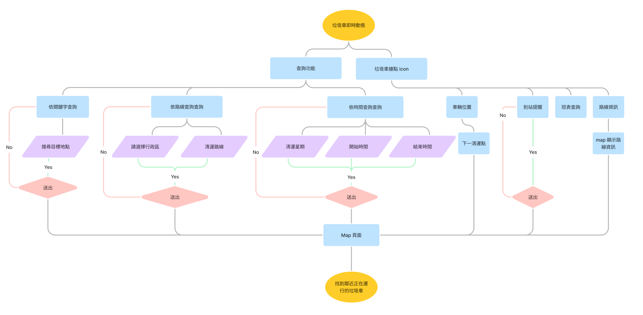
User Flow
It is evident that during the query phase, users need to spend more time making selections, which prevents them from quickly obtaining the information they need.
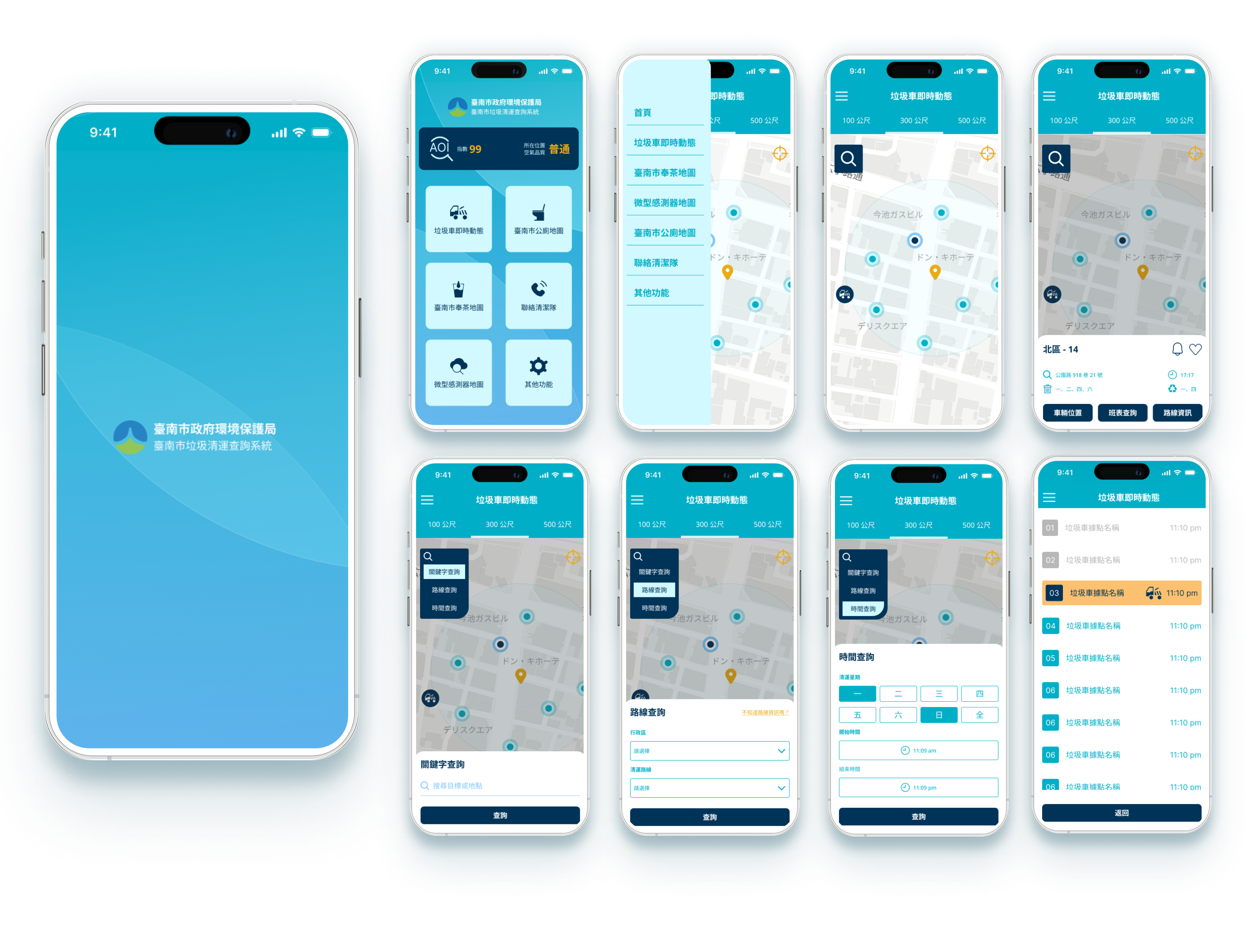
Design Process
Wireframe & Low-Fidelity Prototype
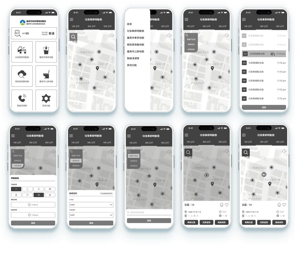
High-Fidelity Prototype
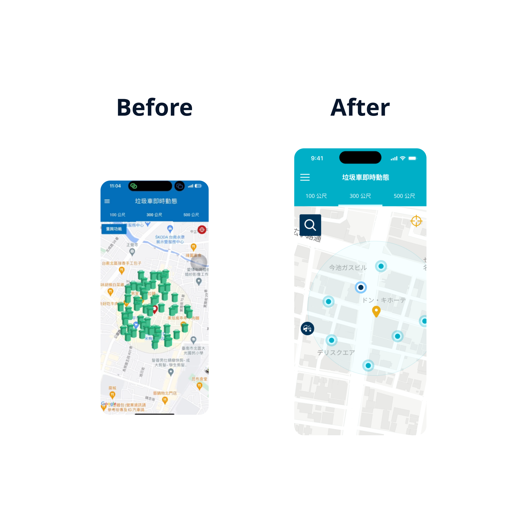
Next, review the existing app interface and conduct a comparative analysis with previous research data to identify issues and set improvement goals.
> The information architecture and hierarchy need adjustments.
> The design style needs to be unified.
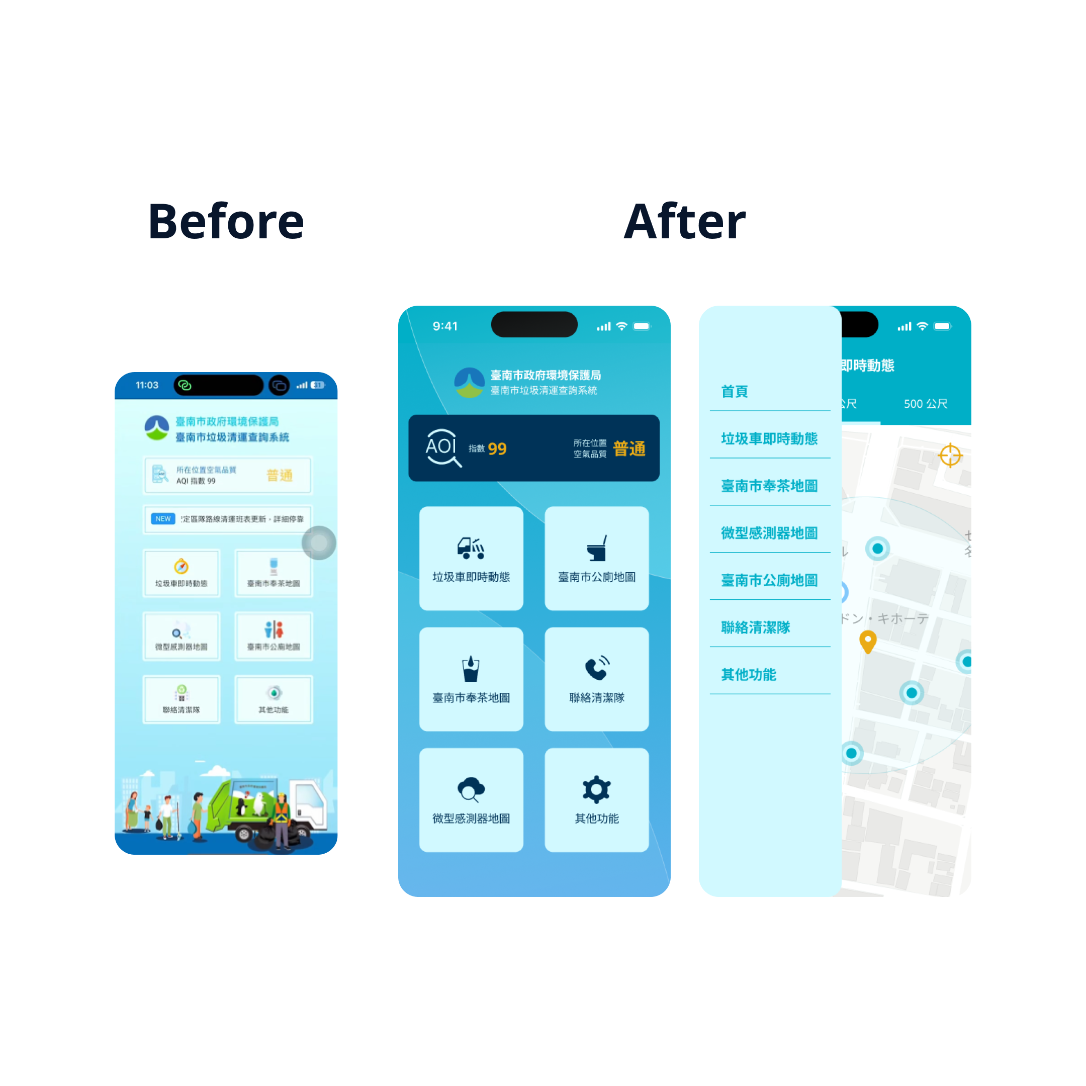
> The location icons make the screen too cluttered.
> The query function can be changed to icon display to simplify the information on the screen.
> Modify the expanded query function page using the same model to enhance overall consistency.
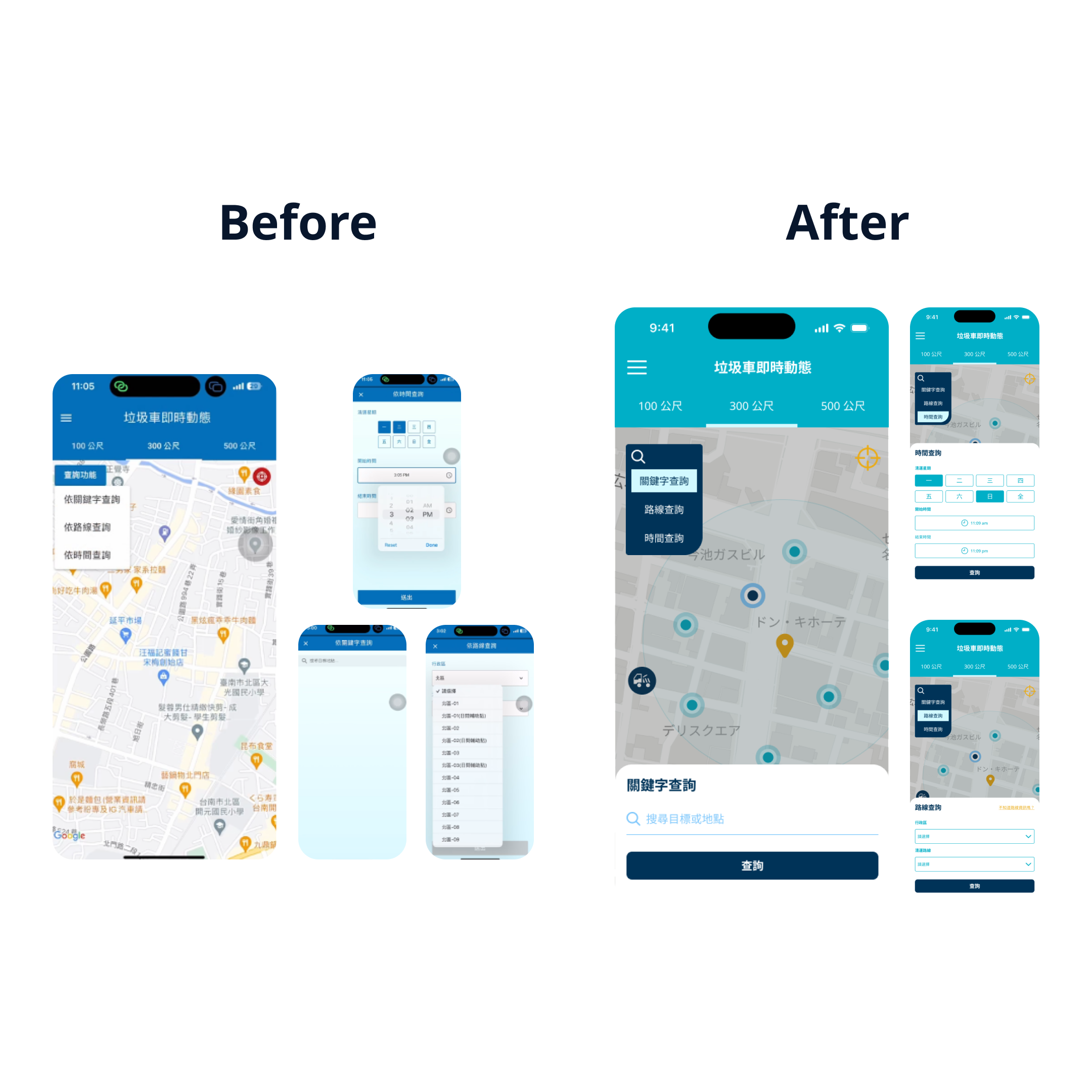
> Reorganize the layout to improve readability.
> The interface becomes overly complex after querying the schedule. Simplify it to a more concise list format, integrating the information on garbage truck arrivals and departures.

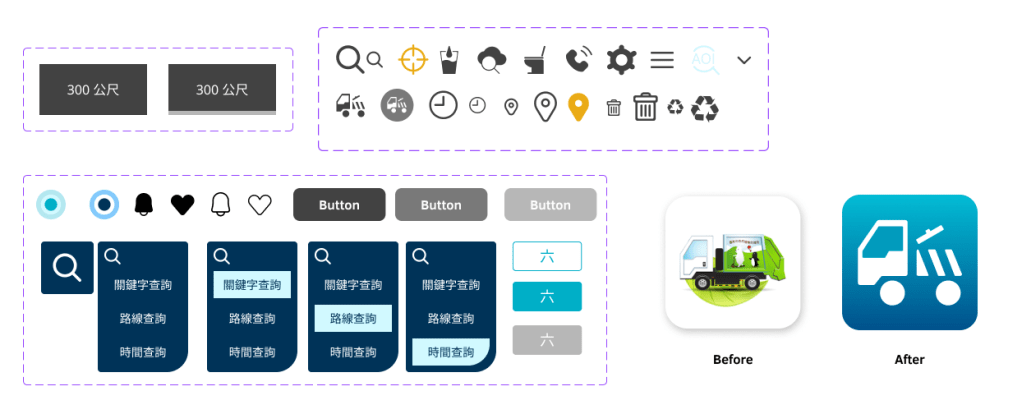
A minimalistic and consistent design style

An intuitive and convenient query function
Simple and easy-to-read route information

Design System

Learning and Reflection
Through this redesign project, I gained a deeper understanding of the product’s background and user information. By focusing on the information architecture and hierarchy, I was able to gradually identify issues and user pain points, then propose solutions and implement designs. For me, this was an invaluable opportunity to practice and refine my skills.
